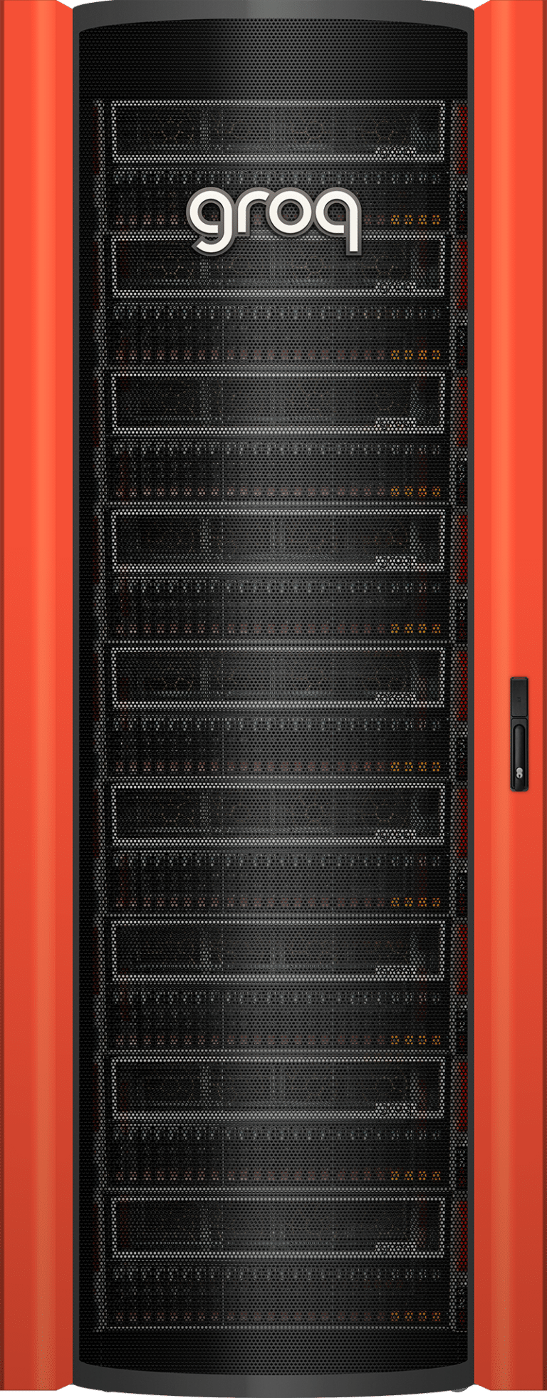
Brand Guidelines
Groq-approved language and assets for using our brand in your marketing and communications.
About
The "Groq" name, the Groq logo, and other Groq trademarks, are property of Groq. These guidelines are intended to help our partners, resellers, customers, developers, consultants, publishers, and any other third parties understand how to use and display our trademarks and copyrighted work in their own assets and materials.
Downloads
- Groq Story Overview
- CEO Jonathan Ross Info & Photos
- Press Releases & News Articles
- Leadership & Board of Directors
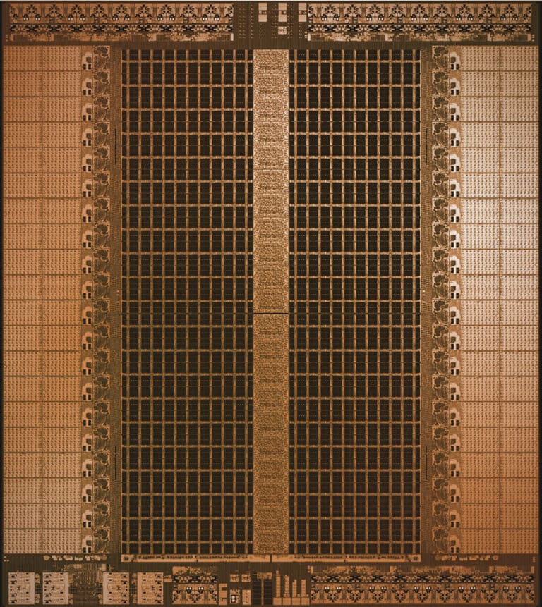
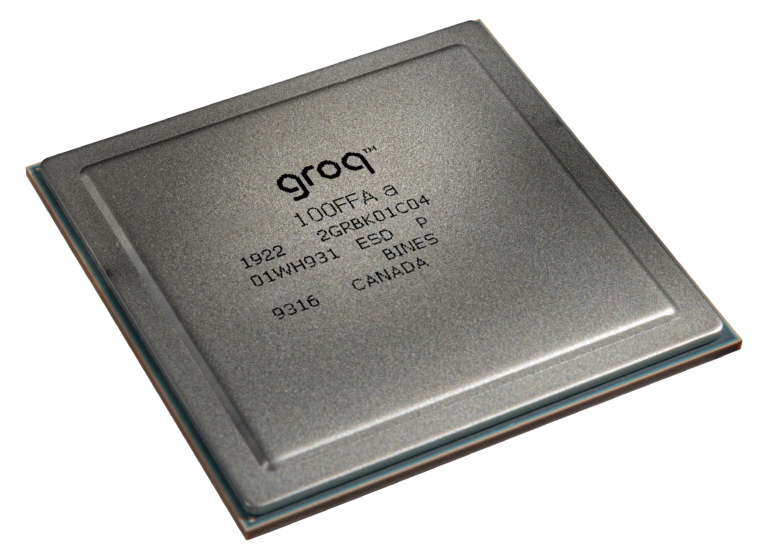
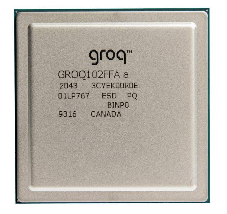
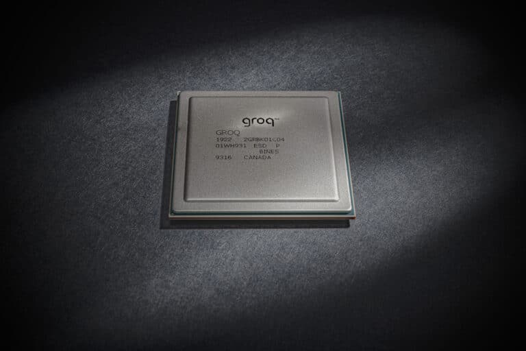
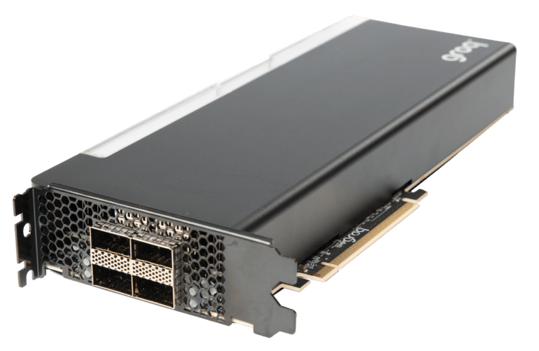
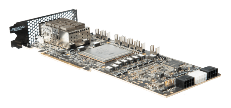
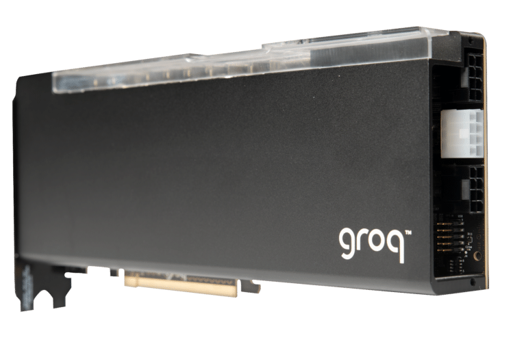
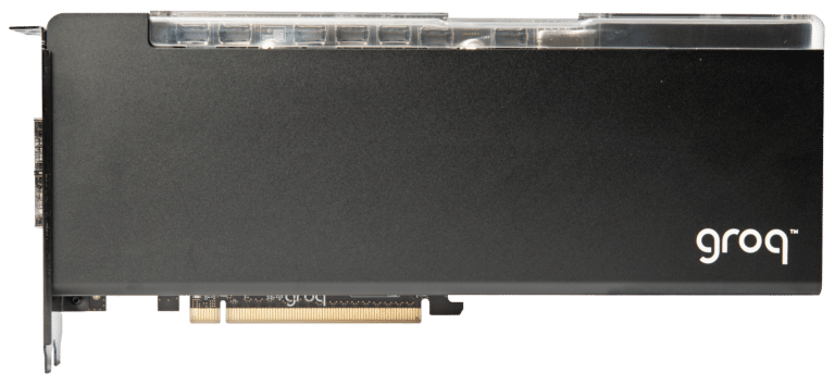
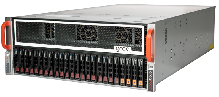
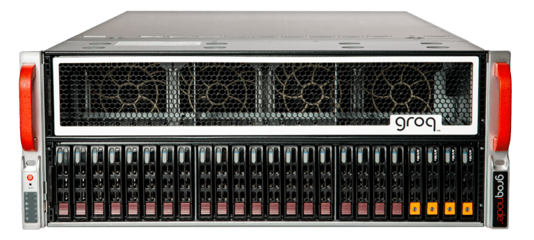
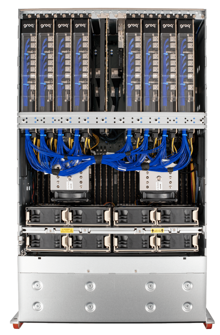
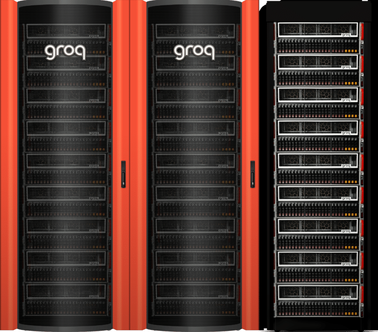
- Product Hero Shots
- CEO Jonathan Ross Info & Photos
- Fonts
Architecture explanations, GroqChat side by side comparisons, Groq use case videos, and leader presentations
Groq Logo
To preserve the Groq logo’s integrity, always maintain a minimum clear space around the logo. This clear space isolates the logo from competing graphic elements such as other logos, copy, photography, or background patterns that may divert attention. The minimum clear space for the Groq logo and the alternate horizontal logo is defined as the height of the “o” in the wordmark. This minimum space should be maintained as the logo is proportionally enlarged or reduced in size.
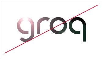
Things to avoid when using our logo:
Other Marks
Additional Groq marks are available to be used at your discretion.
Color
While Groq Orange is our primary color, it should be used discreetly to provide accents and put a sharp point on important information. Backgrounds should be composed of open fields of white and light gray allowing the orange to shine brightly and gain importance even when used in a subtle and reserved fashion.
Primary Colors
Secondary Colors
Fonts
Primary Font: Montserrat
To help provide a consistent and unified look in Groq’s use of typography, Montserrat should be leveraged in virtually all areas of communication—from large headlines to the smallest body copy. The bold and classic shapes create a distinctively Groq look that communicates an ambitious, confident and straight forward approach to conversations with our customers and constituents. The recommended weights of Montserrat are light, regular, medium and semi-bold.
Secondary Font: Consolas
Consolas is to be applied to elements and snippets in short forms such as titles and call-outs in charts and graphs. See our licensing information.
Last Resort: Arial
When there is evidence that Monsterrat and Consolas are not available, Arial is an acceptable replacement.
